
Uncommon is a service for others to feel empowered and heard as they share their stories of being human and making their way through the world in an imperfect manner. Behind Uncommon is the founder and sweetest most amazing photographer and storyteller – Britt. Britt has an amazing and unique life-story and recognizes that life isn’t sun shine & roses all the time. Yet she recognizes that it can be at times. And she wants to hold the microphone while you tell your story and claim it with pride and intent.

One of Britt’s main goals with this brand was to reach her ideal client who is creating an impact by just being who they are, not having to change, and wanting to be energetic and adventurous.
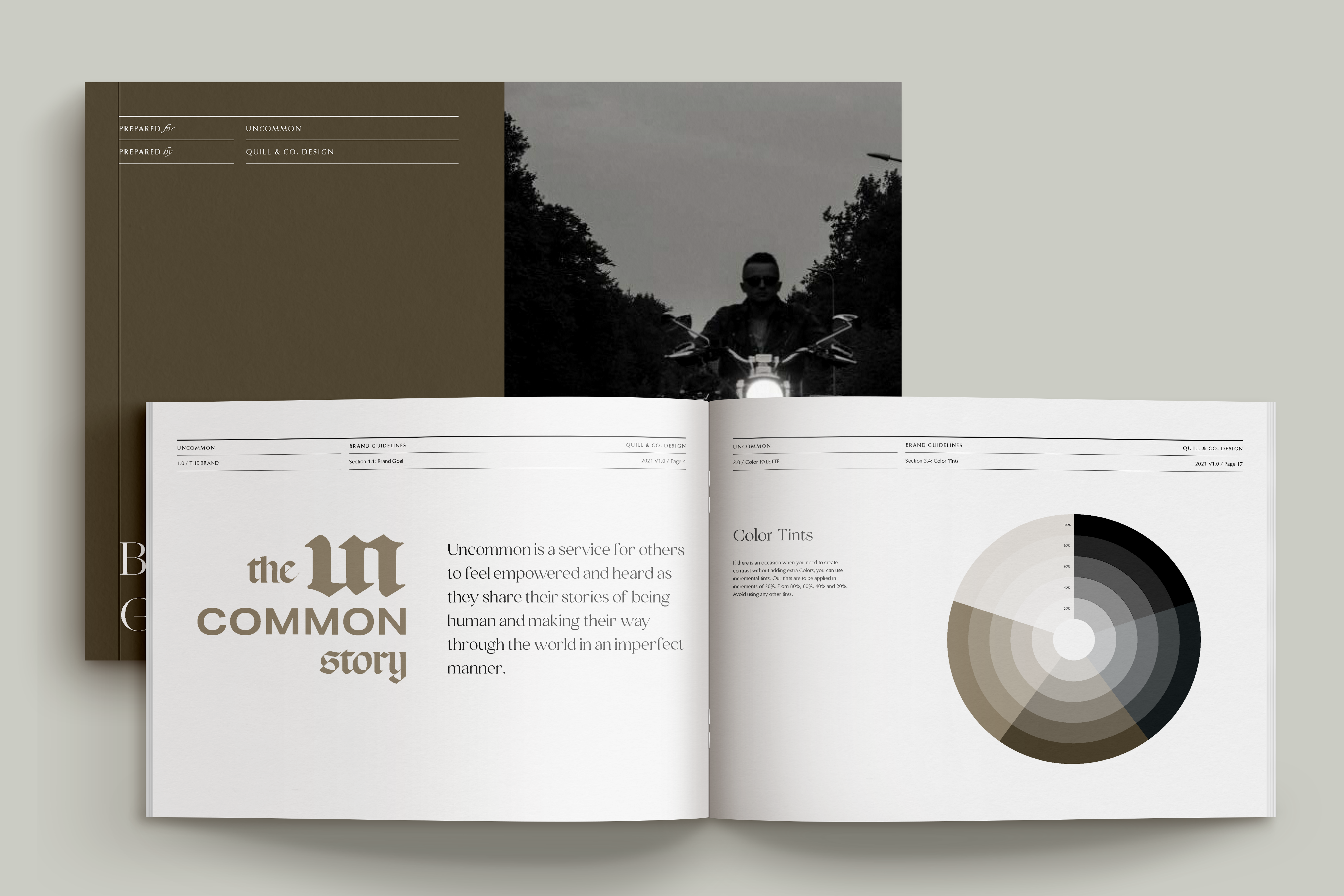
It was important for the branding to be slightly edgy with plenty of personality so that it would appeal to people that live life to its fullest and aren’t easily turned away by a bit of weirdness. We use an edgy font for the wordmark and paired it with a serif font that adds a nice element of refinement to tune in the softer elements of the branding. We also included in her branding elements the usage of collage elements which include things like – florals, statues, buildings, animals, and much more that could be collaged together to tell an uncommon story. To add an edgy yet elegant feel to the brand we went with colors that reference natural materials like wood, stone, leather, and dirt.

Some of Our Favorite Parts of the Branding:
- A dark and moody color palette that brings an edgy yet elegant feel to the brand
- Choice of typefaces used to invoke personality and belonging to appeal to her target audience and ideal client
- The stunning logo suite carries the brand’s personality, edge, and stoic energy
- Inclusion of collage items that can be used in infinite combinations throughout different forms of branding and brand elements.


Check back soon for more brand design spotlights.
Ready to shake things up?
free

Get Access Now!
