
SUMMARY
Using mockups within your website is a great way to make your offerings feel tangible and real, as well as showing what the offering entails. Rather than making you boot up Photoshop to create mockups. We’ve come up with an easy way to build the mockups within Showit. Making it simple to update as needed and work within the same program.
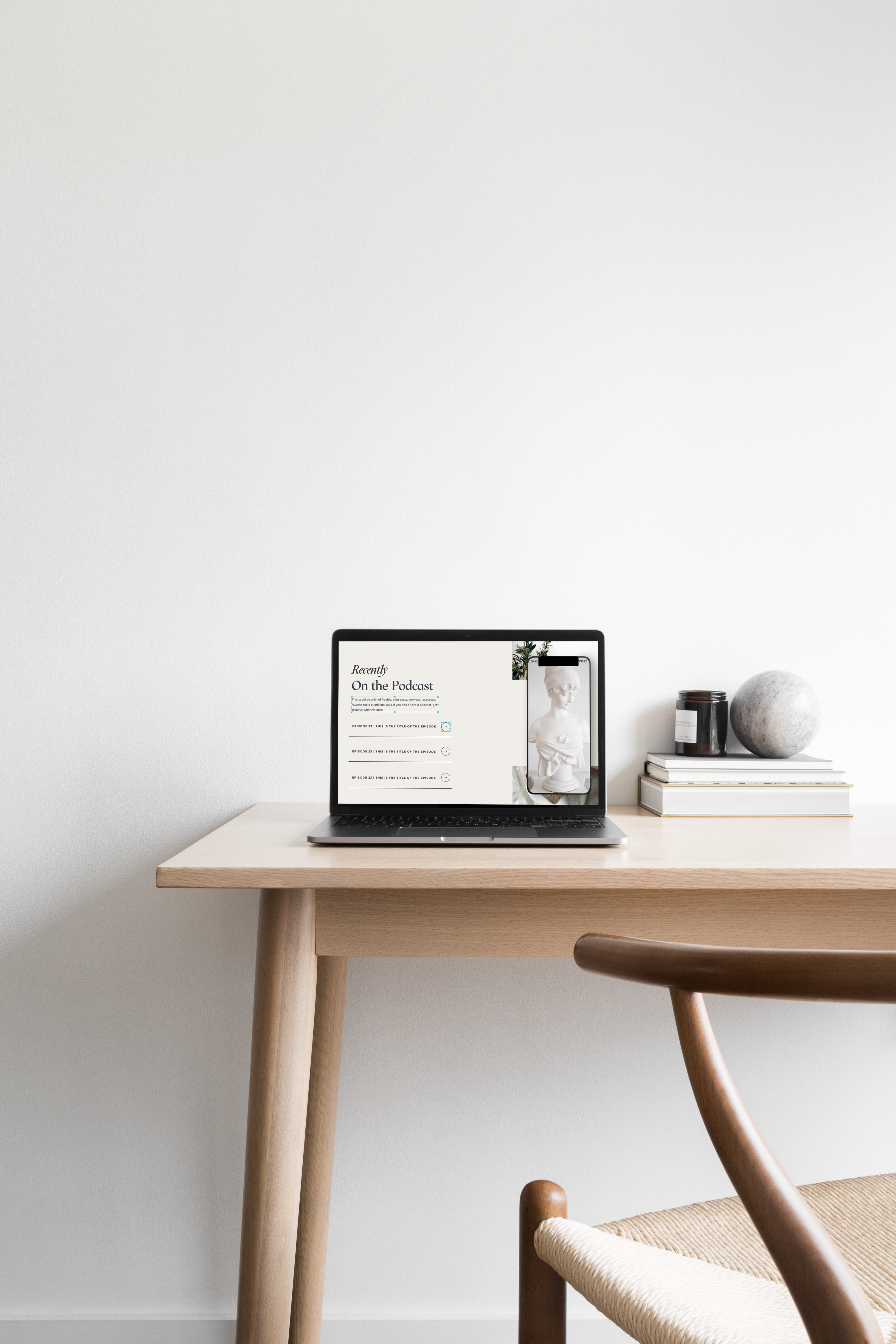
Join me in creating our mockup in three easy steps. For this walk through I’ll be using our up and coming Showit Website Template – Jolie & Jasper. This template comes with a podcast section that includes a mockup on the home page. So I will show you how that mockup was created in order for you to build your own mockups. Weather you are using Jolie & Jasper or any other Showit website, this process will look the same.
IN THIS TUTORIAL YOU’LL LEARN:
- How to add a color block
- How to add an image
- How to add extra small details
Add Color Block
Hover over the square icon in the center of the bottom navigation bar, and select rectangle from the menu. A rectangle will appear on screen! Play around with the settings to : change the color (shape style), change the shape (effects), and the size and location (size and position) on both desktop and mobile.
This rectangle/color block is going to act as the base of our iPhone mockup. To give this the appearance of an iPhone I am first going to size and the rectangle to the correct proportions on both desktop and mobile. Once the sizing is correct go into the tab ‘effects’. Here select the icon of the rectangle with rounded corners, a setting ‘radius’ will appear, set this number to give rounded edged proportional to the size of your rectangle.
Add Image
Select the mountain icon in the center of the bottom navigation bar, and select the image you’d like to add from the media library and select add to page. The image will appear on screen! Play around with settings to: change the size (size and position), image settings (image), and the shape (effects) on both desktop and mobile.
This image will act as the screen of our iPhone mockup. To give this the appearance of an iPhone I am first going to size just smaller than our rectangle to the correct proportions on both desktop and mobile. Once the sizing is correct go into the tab ‘effects’. Here select the icon of the rectangle with rounded corners, a setting ‘radius’ will appear, set this number to give rounded edged proportional to the size of your image (number should be -10 of the rectangle on desktop & -2 of the rectangle on mobile). Place this image directly on top of the rectangle.
Add iPhone Elements
To add the extra little details that is really going to bring this iPhone mockup to life we need to add in some extra elements. I’ve made this as easy as possible by creating a downloadable for you below. Simply click ‘Download iPhone Elements’ a new window will open, click the pencil icon and choose either option, this will open Canva, select ‘Share’ in the top corner and download with a transparent background. OR simply click and drag the image below onto your desktop.

Once you have downloaded the image add it to your media library within Showit.
Select the mountain icon in the center of the bottom navigation bar, and select the image of the iPhone elements from the media library and select add to page. The image will appear on screen! Resize the image until it fits properly on top of the image and rectangle that make up the rest of the mockup, change the size (size and position), image settings (image) on both desktop and mobile.
Now that you’ve learned the mechanics of the iPhone mockup. Try resizing elements & adding in different elements to create other devices such as : iPad, Desktop, etc.
MORE QUESTIONS?
If you have any questions as to how to do anything within your Showit website feel free to send us a message requesting a walkthrough!
free

Get Access Now!
